Monday 30 March 2015
Sunday 29 March 2015
3) What have you learned from your audience feedback?
Focus group feedback
Audience feedback survey for my digipack


GoAnimate survey feedback for my magazine advert
Advert feedback 1 by joewilson1997 on GoAnimate
Advert feedback 2 by joewilson1997 on GoAnimate
Audio feedback survey for my music video
Social media responses


Planning and research feedback
In my feedback, I have learned what my target audiences find useful about my products, and what they would also change. By doing this, it allows me to make changes that will make more people want of the target audience want to view my products. I put my products on to some social networking sites and received comments on them. This allows me to have some more feedback on products from the general public, rather than my target audience. By doing this, I am learning what i can do to appeal to a much wider target audience. My planning and research survey was useful because it allowed me to know what I needed to do to appeal to my target audience.
From my initial research survey, I learned that the majority of my target audience are male and aged between 16 and 24. I also learnt that my target audiences favorite genre of music is rock, and they also like pop-punk and indie. This shows that I must pick a song with in this genre for it to be successful. I learned from this survey that it is important for the video to have relevance to the lyrics of the song, and it has to have narrative elements and the musician must appear in the narrative of the music video.
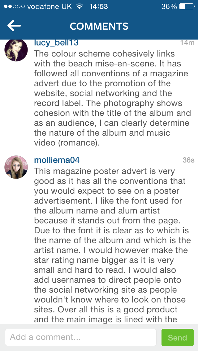
In my social media feedback, I learned that my layout and colours are very good, and the image relates well to the genre of music and to the lyrics of the song. But is also learnt that I could have gone in to more detail with the social media elements of my poster and the colours I used could have been better. Overall, from this feedback, I learned that my product represents the music video well, and has a cohesive style between my products.
Audience feedback survey for my digipack
GoAnimate survey feedback for my magazine advert
Advert feedback 1 by joewilson1997 on GoAnimate
Advert feedback 2 by joewilson1997 on GoAnimate
Audio feedback survey for my music video
Social media responses
Planning and research feedback
In my feedback, I have learned what my target audiences find useful about my products, and what they would also change. By doing this, it allows me to make changes that will make more people want of the target audience want to view my products. I put my products on to some social networking sites and received comments on them. This allows me to have some more feedback on products from the general public, rather than my target audience. By doing this, I am learning what i can do to appeal to a much wider target audience. My planning and research survey was useful because it allowed me to know what I needed to do to appeal to my target audience.
From my initial research survey, I learned that the majority of my target audience are male and aged between 16 and 24. I also learnt that my target audiences favorite genre of music is rock, and they also like pop-punk and indie. This shows that I must pick a song with in this genre for it to be successful. I learned from this survey that it is important for the video to have relevance to the lyrics of the song, and it has to have narrative elements and the musician must appear in the narrative of the music video.
In my social media feedback, I learned that my layout and colours are very good, and the image relates well to the genre of music and to the lyrics of the song. But is also learnt that I could have gone in to more detail with the social media elements of my poster and the colours I used could have been better. Overall, from this feedback, I learned that my product represents the music video well, and has a cohesive style between my products.
Saturday 28 March 2015
2) How effective is the combination of your main product and ancillary texts?
Fonts
I wanted all of my fonts on my products to be similar to give them a consistent look and add continuity between products and so they all combined effectively. I only really used two fonts in my products, both taken from Dafont.com. The font I used for the band name was one that had a somewhat classy and old fashioned look to it. I used this because I like the style of it and I think it stands out compared to the rest of the text. The other font I used was similar to the first one, but this time it had a scruffy handwritten look to it. I used this because I think it represents the genre well and its what you would expect to see from a band within the pop-punk genre. I used these fonts on both of the ancillary texts to make the combination of the products effective and make it easy for the consumer to link products together.
Colour schemes
The colour scheme I used in my products Is called 'The Architect'. I got this colour scheme from a website called Adobe kuler, and this has set colour schemes that are known to work well together, or it gives the user the option to create their own. I used this because it has all of the colours that were quite popular in my music video, such as different shades of blue, and orange. In the pictures I took, these colours are very dominant, because these are colours that represent the sea side, with the sun and the sea. I also find that these colours are very eye catching, which will draw the audience in to the products. Also the seaside colours used, are also used in the beach scenes and all of the sunny scenes in my video,, giving a clear relation between products, and this I think makes my products and effective combination.
Locations
I used a variety of locations throughout all of my products. In my video, I used locations such as the beach, my friends house, a recording studio, and down my friends street. All of these locations play a part in the relationship between the two characters. One of the most important one sis the beach, because this is where the relationship started, and it is where we see the couple staying together at the end. For this reason, I used beach shots the most often in my products because it links all of them together. It is really effective because people will recognize the location from the digipack and poster when they watch the video. The use of the same locations throughout all of the products makes them cohesive.
Cinematography
When filming my music video, I wanted a wide variety of camera angles and shot types. I used high/low angle shots, close ups, medium close ups, establishing shots, and medium shots as the main shot types. when producing the images for my ancillary texts, I wanted to continue using these types of shots in my products to add continuity and to make it more effective. In my images, I used close ups, medium shots, and location shots. This allows the consumer to make a clear connection between the products, making the combination of all my products very effective. I used a diverse type of shots because it makes the video and products more exciting and keeps the consumer entertained.
Friday 27 March 2015
1) In what ways does your media product use, develop or challenge forms and conventions of real media products?
In my planning and research, I looked at certain things about existing music videos that I could use to make my music video look as realistic as possible.
Below is my LIIAR analysis of existing music videos of the same genre. I did this to help point out all of the different elements I could use in my video. It gave me ideas on how the narrative should be, what types of performance shots could be used, and also some ideas on locations and other mise-en-scene elements.
Below is my research in to different editing techniques and shot styles and effect that I could use in my own video. These could help develop conventions in my music video because a lot of the effects used are very common in music videos and they could have been very effective in my music video.
Analysis of my own product
Cinematography
I used a variety of shots throughout my music video. The
most commonly used shot in my music video is the medium close up. I used this
shot because it is very effective when switching between characters because it
shows them in the same way. It is also good because it gets enough of the
location in to know where they are, but it’s not too far away that the
characters are unrecognizable. In my music video I used backwards tracking
shot. This was also a handheld shot because it was of the couple walking. I
used a tracking shot because it feel the use of it matched the pace of the
song. In my music video, I used establishing shots to show the different
locations that I used throughout.
Mise-en-scene
In my music video I used a lot of different locations. This
was done to show the effect of time passing by and to keep the story from
getting boring. I also used a few different costumes for my characters to show
that it is at different times of their life and also to show the type of people
they were at the time. I had a wide range of props that was used in my music
video. One of the important props that were featured was the golden wedding
ring. In this moment, the wedding ring shows the advancement of the relationship
and helps move the story along. Another important prop is the use of the
instruments, because without these I would not have been able to have the
performance scenes, which are a conventional element of any pop-punk song, but
we also would not know what the characters are doing.
Editing
In my music video, I used jump cuts mainly to transition
between the shots because they are quick and snappy, matching the pace of the
song. In some parts, I used fade to
black edits. When I used these it was to slow the pace of the song down because
the song may have been in a bridge or it might have been right at the end of
the song. The fade edit is good because it is smooth, and glides down, rather
than just cutting away, making it not like a jump cut which is snappy. After
one of the fades I edited in a blank space. This was to completely hold the
narrative and the video because the song was in a very slow part and the edit
was used to build up suspense, ready for the music to pick up again.
Thursday 26 March 2015
Audience feedback on my final products
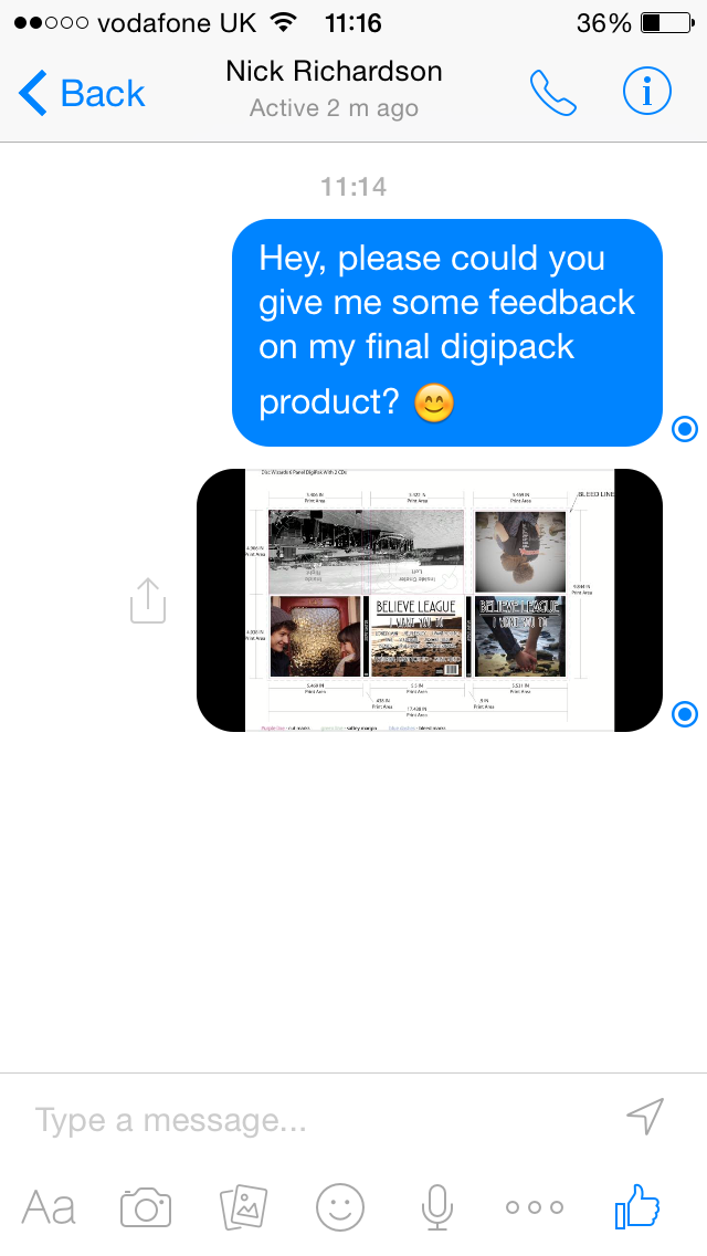
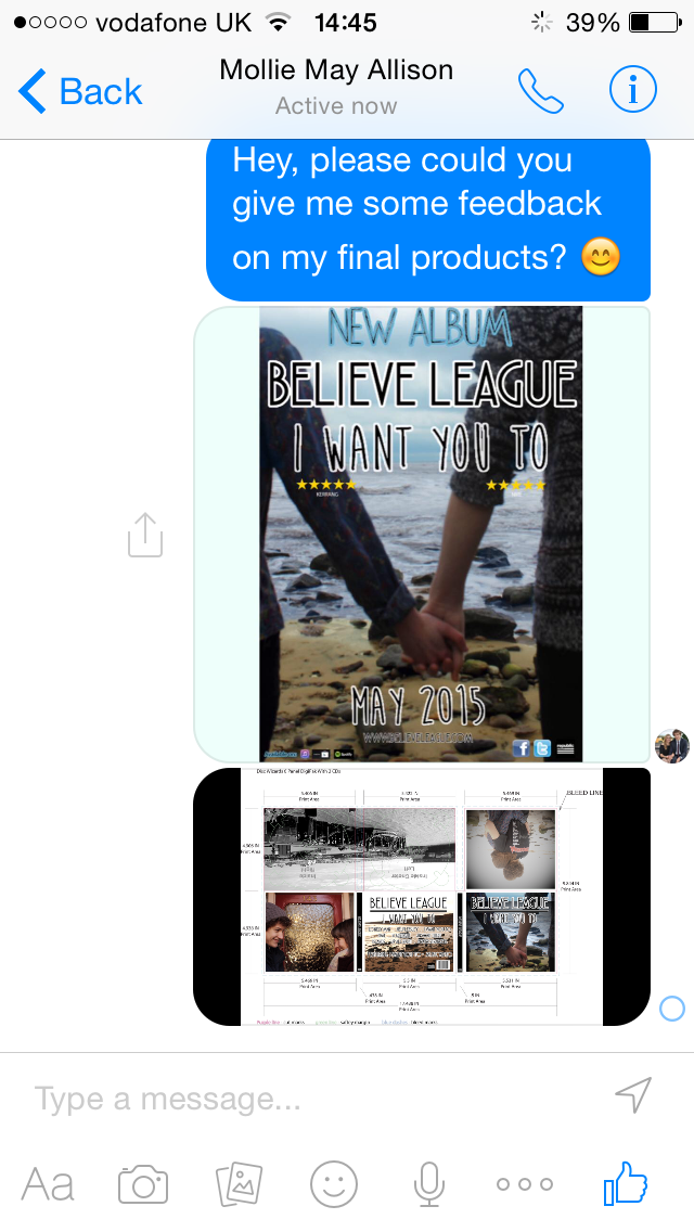
To get my audience feedback, I used a variety of social networking sites, and I used a variety of ways to gather the information that I need. I used websites such as survey monkey and Facebook to get some of my feedback. I also did person to person interviews and took notes on what the people said to my questions. I then transferred the script in to GoAnimate and replicated the interview using characters and text to speech voices.
Magazine advertisement feedback
GoAnimate
Advert feedback 1 by joewilson1997 on GoAnimate
Advert feedback 2 by joewilson1997 on GoAnimate
Music video feedback
Survey feedback
Digipack feedback
Survey feedback


From my results, I have found that the majority of the people I asked were male and between the ages of 18 and 29. This is what the target audience of the product is so what these people say is what i need to take most in to consideration and apply changes they suggest. From my survey about my digipack, I found that the better things of my product is that it looks professional, the images I used were very good, the layout and design of the product is very good and the colours were very good. Some of the things that was not too good, was the text colour on the back of the album because it did not stand out very well and some of the other text colours because it does not stand out very much. I also found that it is conventional to the pop-punk genre, but it does look a lot like a pop album cover, but that is due to y music video heavily influencing the digipack. In my magazine poster surveys, I found that the picture used relates very well to the music video, looks very professional, and follows conventions of a typical advert of a song like this. I also found out that my photo editing was very useful. I also learnt that the font of the album name does not stand out too much. I also found out that there are some parts of my product layout that aren't very good.
Magazine advertisement feedback
GoAnimate
Advert feedback 1 by joewilson1997 on GoAnimate
Advert feedback 2 by joewilson1997 on GoAnimate
Music video feedback
Survey feedback
Digipack feedback
Survey feedback
From my results, I have found that the majority of the people I asked were male and between the ages of 18 and 29. This is what the target audience of the product is so what these people say is what i need to take most in to consideration and apply changes they suggest. From my survey about my digipack, I found that the better things of my product is that it looks professional, the images I used were very good, the layout and design of the product is very good and the colours were very good. Some of the things that was not too good, was the text colour on the back of the album because it did not stand out very well and some of the other text colours because it does not stand out very much. I also found that it is conventional to the pop-punk genre, but it does look a lot like a pop album cover, but that is due to y music video heavily influencing the digipack. In my magazine poster surveys, I found that the picture used relates very well to the music video, looks very professional, and follows conventions of a typical advert of a song like this. I also found out that my photo editing was very useful. I also learnt that the font of the album name does not stand out too much. I also found out that there are some parts of my product layout that aren't very good.
Wednesday 25 March 2015
Ancillary text - Second edit magazine advert

Monday 23 March 2015
Friday 13 March 2015
Ancilliary text - Digipack - First edit

For my digipack I have used images that i took at the beach. I used these images because it is where the love between the characters first began. It is also where the music video starts and ends. I also used pictures form the beach because the pictures I used for my magazine advertisement are set at the beach. Using pictures from the beach in my digipack will make my products much more continuous and will show the relation between each. When making my digipack i wanted to make a clean, minimalistic look. This represents the purity of the song, with it not having many instruments and having quite raw sounding instruments. I think this follows conventions of this type of music and it is a good representation of the music video.Thursday 12 March 2015


Ancilliary text - Magazine advertisement - First draft

Ancilliary text - Digipack - Conventions

Name of band/artists - This is often used so that the audience can find the album easily and know which artist it is. It is also used as some sort of promotion because people will see the name on the cover and remember the name of them.
Main image - The main image is often used to draw attention to the prduct because it grabs the attention of the consumer. Most images will relate to the song or the genre of music the artist fits in to.
Name of album/single - This is used to help people find the album and it is often named after one of the tracks on the album. o people could use this to find the album

Main image - The main image is to make the album look exciting and it is often used to give the album pack continuity.
Record label - This is often placed on the album cover to advertise the record label and also incase there are any complaints about the album, they know where to go.
Track listing - The track listing is placed on the album cover so the consumer can easily find the tracks they like and on CD players, you can skip to the track that you like and it will show the names on the CD player.
Barcode - This is on all CD covers so that they can be sold in shops.
Artist - The artists name is often put on the back of the album. This could be a reminder or it could be more information about who produced the album, rather than the perfomrers or writers.
Subscribe to:
Posts (Atom)